
Hello, I am Kaveh Ashourinia, and you are listening to Typocast on Quantization.
Kaveh: Typocast is focusing on the intersection of type and inclusion.
By type, we mean typography, type design, people of the industry, and various writing systems. And by inclusion, we mean areas where we could add more voices and diversity and talk about domains that are usually overlooked or ignored.
We are excited to announce Richard Hunt has joined us for the series. He is a typographer and type designer and teaches in these areas. I have known Richard since my school years when he was my professor, and he has been a mentor since then.
Richard: My name is Richard Hunt. My career in typography began with working in type shops back in the 1980s. I subsequently opened my own type shop, and then in 2002, I began teaching typography courses, including typeface design and the history of typography. Bloomsbury Publishing recently released my book, Advanced Typography.
Kaveh: For the first episode of the series, we asked Titus Nemeth to join us to discuss his practice as a type designer and researcher and talk about Arabic typography. Titus is designing Arabic typefaces for more than a decade. He wrote several articles about Arabic type and also presented at a variety of conferences and events. His book, Arabic Type-Making in the Machine Age, is a valuable read for anyone in the type community. Our conversation with Titus comes in two parts, so don’t forget to tune in for the second part.
This is episode 19, volume 1 of Typocast, Arabic type with Titus Nemeth!
[Music]
Kaveh: Hello Titus and Richard! Thanks for accepting my invitation, and I am happy that this Typocast series has finally started. It is a pleasure having Titus as our first guest. We have started talking about this project with Titus months ago and exchanged some emails and ideas. But here we are. Welcome!
Titus: Thank you, thank you very much for having me. Thanks for inviting me to Quantization.
Richard: And thanks for me too, thanks Titus and Thanks Kaveh for arranging all these.
Kaveh: Can you start with a brief introduction, please?
Titus: Right. Well I’m currently a research fellow at the University of Reading at the department of typography and graphic communication. And there I’m pursuing a three-year research project entitled Typo Arabic that is funded by Marie Skłodowska-Curie grant, but a European commission. I’m a Jack of many hats, in that way I do practice as a designer. I am an academic in the sense that I do research and try to produce scholarly output in forms of books and articles. And yes, I have been teaching typography type design and visual communication in different schools. And yes. And at the same time, I’m an independent type designer and typographer.
Kaveh: Great! As said before, this Typocast series is on type and inclusion. The inequality in available resources and representation of almost any scripts or writing systems other than the Latin alphabet is a sharing point of these two implications.
During the preparation for this episode, we spoke about the non-Latin term and how the type design community is skeptical about using it. We decided to share our ideas and open the conversation by talking about the discussion’s background rather than ignoring the argument and only skipping the term. Could you share your opinion with us and tell us what is wrong with this term?
Titus: Yeah. Thanks for bringing this up. It’s been a bit of the elephant in the room in the last few years, and just recently that has caused quite some intense debate. Specifically the term that is most frequently talked about is non-Latin. And it is not an ideal term for many reasons, it’s quite an unfortunate term and I think everybody acknowledges that. I have not yet come across anybody who endorses the term, who thinks it’s a great term. So I think that has to be stated from the outset. It’s not a good term. For obvious reasons, it bundles everything, all the scripts of the world that are not Latin in one category. So many things that have nothing in common with each other are grouped under one name. And it does so in reference only to Latin. So everything is measured against Latin, and it’s the negative, it’s the non-Latin, which of course has negative connotations. And there has been some very justifiable objection to that term.
Titus: Now on the other hand, I think it’s also important to recognize where this term comes from and what it… and I think if we look at it historically, it starts to make a little bit more sense. Non-Latin emerged from the overwhelming dominance of the Latin script in typography, and that is an undeniable fact even though movable type was first used in East Asia and in China and in Korea, well, before Gutenberg invented it, so to speak, in mines in the 1450s. It didn’t catch on as much as it did in the late 15th and 16th century in Europe, and nowhere on the world it turned into the mass medium that we know from the Western world.
Titus: Wherever you look, typography only became a mass medium in the late 18th, 19th century. And so at this stage, you look at hundreds of years of a very developed Latin typographic history, and it had established preeminence as a medium. So from that perspective, non-Latin, everything that was not Latin or actually better, it would be even more appropriate to the talk about non-European because whereas the distinction is between Latin and non-Latin, the non-Latin scripts, Greek and Cyrillic were catered for and were developed quite early on in much more variety than many other scripts of the world.
Titus: So when other script were starting to use typography mostly in the 19th century, the point of reference was Latin and hence the Eurocentric or Western-centric perspective of, well, there is typography and a small section of that, that we only start to develop now is non-Latin. So of course, all of this is still a Eurocentric perspective. So one can justifiably object to that. What I find important or useful to keep in mind is that all of these scripts have a shared experience. And the shared experience is that they have not seen the attention, and the technological support, and the know-how, and the history that Latin typography has had. And from a historical perspective, it can be useful to acknowledge of this disparity in order to now address it and hopefully rectify it.
Titus: So from my perspective, there is narrow range where it may make sense to talk about the experience of non-Latin scripts and how they fared usually in a much underrepresented kind of way compared to Latin. And then once we have acknowledged this situation, I think that is the first step to overcome it.
Richard: I think that’s interesting. I was just looking the other day at an estimate, and this is an estimate from a couple of years ago, that there are over 500,000 Latin typefaces in the world and probably one or two orders of magnitude, fewer typefaces from other scripts. All of the other scripts combined is going to be less than the number of Roman originating typefaces. And that seems to be accelerating to some degree in that for every new typeface in a script, other than a Roman, will probably be a hundred Roman scripts made.
Titus: Yes, that there is still a very strong imbalance. What is positive is that, over the last 20 or so years, there has been many other typographies, so to speak, have begun to catch up in some measure, of course not in the magnitude, but they have received more attention, and I think that is absolutely necessary. And it’s very much one of my drivers in my work.
[Music]
Kaveh: From the Typocast’s point of view, I should say that we admire the community’s sensitivity to all problems and damages induced to various languages and societies during the technological adaptation or by other colonial forces. And one of the reasons that we started this podcast is talking about these issues and looking from different perspectives than, let say, only the Western perspective.
But in practice, it may not be possible to mention every single writing system we know without forgetting some when we want to talk about many scripts. And it depends on the context, too, like; during a discussion about Arabic typography, we may use the term non-Arabic type. So, if we use the non-something combination, it doesn’t mean that we favour a culture or language against some others.
[Music]
Kaveh: Also, a segue to one of my other notes from the end of the list of questions. What is the status of Arabic typography and type design compared to the Latin typography or type design?
Titus: Let’s put it this way, when I started my work on Arabic type design as an MA student at the University of Reading, there were visiting lecturers who were also type designers.
Titus: And I remember one lecturer coming in and asking me what I was doing and how come I had chosen Arabic. And I told him about my interest. And he said, “Well, that’s all nice and fine, but don’t you expect or count on selling any of those. You’re not going to make a dollar from this.” Which was a bit odd for me as a student who only wanted to pursue this out of interest. It was a personal and cultural interest. And I said, “Yeah, that’s fine. Let’s see what happens. I’m just giving it a go and seeing where I can take this.” And that was in 2005.
Titus: In 2005, there were two or three foundries that had any Arabic typefaces in their catalogs. I remember around that time FontShop, the very big type of foundry had just added one first Arabic font to its tens of thousands Latin fonts. The main catalog was the one of Linotype which had, by and large, been developed, well, throughout the 20th century. There were a few new additions, but… Yeah, there were maybe a dozen Arabic fonts that Linotype sold at the time. And that was it.
Titus: Then there were a few system fonts that were provided by Microsoft, by Apple, but there was hardly anything like an Arabic type design seen in the community. And over the last 15 years, this has changed very clearly and very much to the better. So now there are a handful of dedicated Arabic type design foundries. It receives more attention by, let’s say, mainstream IT companies. So there is movement. Of course it’s still far away from the breadth of Latin typographic choice, but the speed of development has been accelerating, and also we start to see different voices, we start to see different opinions.
Titus: So there is not Arabic type design and everybody agrees, but there are different strands of approaches that have different ideas on how to approach Arabic type design. And I think that’s a very interesting and positive development. And I think the jury is still out, which are the more successful solutions. It may well be that in 50 years one can look back and say, “Well, these were some attempts but they turned out to be dead ends. And these were the more successful takes, but we don’t know yet.” So for example, what is an Arabic Sans Serif? The whole notion of sans serif is difficult to define in Arabic typography because there are no serifs in the Latin sense to start with. So we can only talk of low contrast, low modulation at designs.
Titus: And there are now very different interpretations of how to design a low contrast type in Arabic. And it’s all very new because 20 years ago, there was barely any low contrast type. There were just high contrast Arabic typefaces that had much stronger marks of the handwriting tool. And so there is a ferment, if you want, a negotiation of formal ideas, that is not a done deal yet. So it’s interesting. I think there’s a particularly interesting times for these underrepresented cultures of typography, because there’s still so much more to be done. We can have the umpteenth sans serif in Latin that only differs all that much from the other one. Whereas in some other scripts, everything needs to be decided, and it’s fabulous. It’s very interesting and a good moment to work in these areas.
Kaveh: It’s absolutely a valid point!
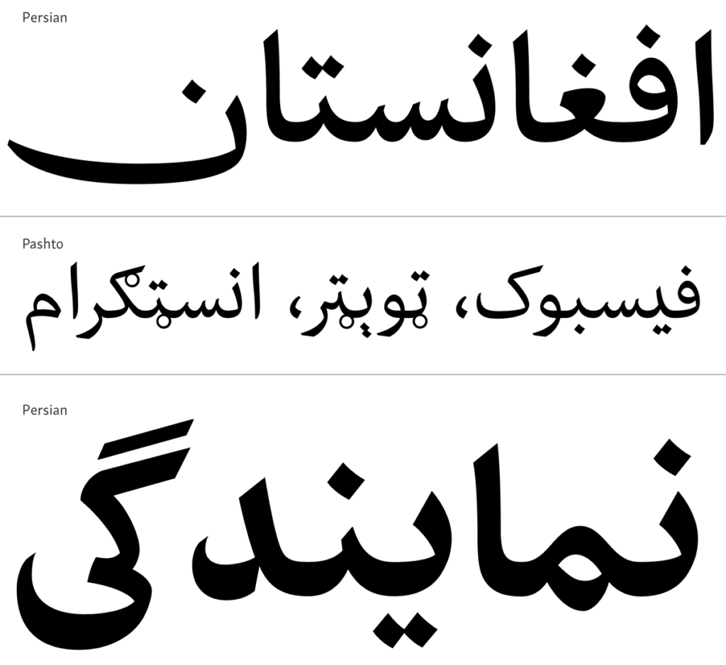
Sometimes in my conversations, people ask me about the serif vs. sans serif Arabic or Persian types and sometimes ask me to show them some examples. Even I had this conversation long ago, back in Iran. But my point is, where is serif in Arabic or Persian. These writing systems have entirely different mentalities, tools and ideas of writing, letterforms and representation. We should measure and categorize with other methods that have come out of those languages. It would apply to other writing systems, too, although we are not covering other writings in this episode.
Titus: Yes, now, absolutely. Yeah!
Richard: I think your point about the structure and the modulation is really important. I know that Roman typefaces through their history, they started off… If you look at say Jenson’s typeface of 1500, it really does reflect quite strongly, the pan hand, the writing of humanist manuscript, and it strays away from that until by the modern era or the modern typeface of the 1800s, like of the Bodoni’s, there are pretty abstracted versions of that, whereas you have thick and thin strokes that come from the pan in say Jenson’s typeface. You have thick or thin and modulating as quickly as possible between the two in the Badoni. The thing that I think that I’m always curious about is the industrial revolution and all those advertising faces really made a… kind of opened up the field of Roman typefaces. And is there an equivalent of that in the evolution of the Arabic typeface?
Titus: Thanks, Richard. I think that’s an excellent point and it connects directly with what I tried to talk about earlier in reference to the terminology, the non-Latin et cetera. Because the fact is that the typographic histories of most other scripts are significantly shorter than the typographic history that we know from the European tradition. So the two points that you have just evoked, they are separated by some 300 years, and that’s only Jenson and Bodoni, and if you talk about the industrial revolution at another 150 years. And that is exactly part of the interest and part of the ferment that is going on in other scripts. Arabic typography was although known, was not practiced in the middle East for 400 years.
Titus: So even though Jewish migrants, refugees from the Spanish reconquest in Andalusia, came to the Ottoman Empire and brought with them movable type printing. It was not adopted by any Muslim Arabic printer in the Middle East, the way European attempts to print from the 16th century, and they shipped books printed in Arabic metal type in Europe, in Italy, and later in Germany, and in the Netherlands. And they were sent to the Middle East and nobody cared about them whatsoever. They were unacceptable. They had no success by any measure. And it’s only in the 18th century, in the 1729, that the first Muslim Arabic print shop opens in Istanbul.
Titus: But again, it remains on a very small level. It doesn’t trigger a publishing, print revolution. This only happens around the middle of the 19th century. So you get 400 years of complete… We don’t care about these technology. And then all of a sudden in the 19th century, it’s been taken up by indigenous printers that use locally made Arabic typefaces, and it starts the printing and publishing revolution. But what this shows is that the history that we have in Arabic typography is so much shorter.
Titus: So in a way, all those developments that had some 400, 500 years to gradually happen in the Europeans fare, are now compressed into a much shorter time span. And I think this is particularly pronounced now in the digital era where stuff just happens more quickly where there are more parties involved and more agents, and there is the means to work more quickly and the influences travel around the globe much more quickly. And so, yes, everything is compressed into a much shorter space. And that’s very much what I was talking about earlier when I mentioned this negotiation of different ideas that is happening at the moment. So yeah, we didn’t have a sans serif in Arabic 20 years ago. Now there are competing ideas about what a Sans serif should look like.
Titus: And at the same time now there are, of course, more traditional or traditionalistic approaches that say, “Well, we don’t want to throw everything that we’ve had. Thrown out through the window and only get inspiration from Eurocentric typography. But we want to look back at our own heritage and see what we can use of that, and how we can translate that for contemporary use. I used the term traditionalistic, which is not quite what I meant, it casts a negative light that I didn’t mean to imply. I think there’s more like a harking back to original sources, let’s put it that way. And I think that’s a very fruitful, and there’s a lot of potential in that approach.
Richard: Yeah. Something similar happened when the Monotype and LineTech type came along and all these historical typefaces were revived, which had basically been gone for hundreds of years. Things like Janson, Bembo, both faces based from around 1500, which had really been evolved away from, but when the LineTech type came along, a bit like the computer, it created a market that required people to come up with new typefaces to supply the Monotype, LineTech type machines. And they went to historical references. So perhaps something similar was happening today with the Arabic. Maybe you could expand on that.
Titus: In a certain measure, I think that is true only that the references are not so much typographic models. Like what you have mentioned, they were already revivals of type that have been made.
Richard: Right.
Titus: That is not so much happening yet. There are some instances, but it’s mainly a looking back at the manuscript tradition because there is this break between the manuscript tradition and typography, and that’s very much a technologically induced break in which the typography, as a medium, was not up to represent Arabic script with all its characteristics. Letterpress printing and movable metal type were made for the Latin script. And the Latin script is the odd one out compared to most other scripts of the world in the sense that it is extremely modular and it has a fairly limited set of proportions. And this works very well for little bits of metal that you put next to each other. These little bits of metal don’t work so well for those scripts that have other properties. And that was the case with Arabic. And when Arabic was adopted to typography it lost a lot of its features that had evolved over hundreds of years of manuscript practice.
Titus: So yes. Now, if anything, people look back at calligraphy and see what was there that we’ve lost when type was introduced. And these breaks are quite interesting again, because even though there is now Arabic typography being practiced now for, let’s say, 150 years in any significant scope, the evolution is not at all linear. We don’t get better Arabic type and better Arabic typography with every step of technological development. Quite the contrary, I would argue, when we look at the foundry type that was used for hand-setting, that was made for hand-setting in Istanbul, in Beirut, in Cairo, where they didn’t make so much, but they used it, in the second half of the 19th century, they used more complex and more advanced Arabic typefaces than the majority of digital Arabic typefaces that are in use now.
Titus: And they just bothered to take the time and set it manually, which was a painstaking labor, and then came along mechanization, which completely wreaked havoc on all of these, because the machines again came from the West, they were again made for the Latin script, only they were even more limiting than the system of movable type was, because the machines had their internal logic, especially, so the Linotype. It had in its main magazine only 90 characters. So that meant any script that had to be composed on the Linotype had to be reduced to 90 characters to be composed at a reasonable speed, because yes, you could have multiple magazines, but then changing them made the whole process too slow for anyone to be interesting. And that changed the appearance of Arabic and many other scripts in fact.
Titus: And then as the 20th century advanced, we got photocomposition, and with photocomposition, the first computers came in. And there are actually some phenomenal ground breaks were achieved with early computers that drove photocomposition machines. But this happened in the late eighties, and in the late eighties photocomposition was on the way out, it was about to die. And when the desktop publishing happened and everything went into personal computers, we lost a lot of competence of craft knowledge. And in the first 10 to 15, maybe 20 years of the desktop revolution, the computer engineers were busy achieving typographic functionality for Arabic that was primitive for all extents and purposes. They had to work on making or “Let’s make it work to compose from right to left. Whoa, achievement. We cannot compose them right to left but we can…” I don’t know. Have to let us take the right position, et cetera. Things that were achieved on the Linotype, in hot metal in 1960s.
Titus: So even though you had this presumed advantage of digital technology, in the first 20 years, it had to catch up to achieve a level of typographic support that was there for the preceding 50 years.
Kaveh: Sounds very exciting. But I suggest keeping some parts for the next recording and going to the top of the list.
[Music]
Kaveh: Maybe the first question I had to ask was how you become interested and then an expert in the field of Arabic type design and typography, and what was the process?
Titus: Okay, thank you. Yeah. Well, I started my path, let’s say, just in a fairly conventional way. I went to a graphic design school here in Vienna, in Austria. And during this course, I discovered that I was really interested in typography and by extension in intact design. And I wanted to pursue this further. I was not really taken by corporate design and advertising as a trajectory for me. So I thought typography is something that I could develop further. And so I looked for places where I could do a master’s degree in type design. And that led me to the University of Reading and its MA in Typeface Design. And there I had shown in a portfolio that I had produced some books, small scale publications in Persian and English for Bilingual Publications.
Titus: And with that referencing, my portfolio, the program director Gerry Leonidas, he just encouraged me very much to pursue this further. And I remember very well in one of the first meetings as a group in which Gerry was emphasizing the interest and value in developing, now there comes the term, non-Latin type design for all scripts of the world. Then he just turned to me and said, “And you are the one who is doing Arabic, right?” Which came as a surprise to me because, yeah, I didn’t think I could do that. I had studied some Arabic in evening classes before going to Reading, just out of interest. I had traveled a bit in the region. My family had lived in Algeria when I was a little kid. Apparently I started to speak Arabic, but I didn’t retain too much from then. And because of this just general family background, family interest in… Not a background of descent, but just we lived there, we had friends from the region, and we had an interest in various cultures and Arabic amongst them. And so that’s what triggered my general interest, let’s say.
Titus: And when I came to Reading, I thought I would do Cyrillic type design because I had studied Russian for eight years at school. So I was very familiar with Cyrillic script. But yeah, once I was encouraged and put out to me that I could do that. I thought I’ll give it a go and try and see where this goes, mainly because I felt if I don’t do this now, I’ll never learn it, so I might as well just try it. And in the Reading days, well, they have a very good approach to this subject in using lots of collections-based research to show students and aspiring designers historical references. They have an excellent network of designers that consult the aspiring students on their respective projects, and I was lucky enough to have Fiona Rose as supervisor too. And she has an excellent track record of type development for various scripts amongst… wait, she’s Arabic.
Titus: And yes, during the course of the program, I was also supported and was given feedback by other Arabic designers, namely, Kamal Mansour, Mamoun Sakkal. And all of these came together to this project that I called Nassim. And once I had finished my course, the DMA course, I submitted the design to the annual Type Directors Club of New York competition, and it was selected to receive the certificate of excellence in type design. Yeah, that set the ball in motion for me to take this further.
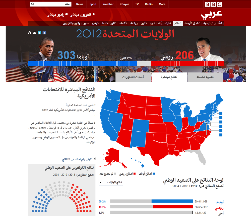
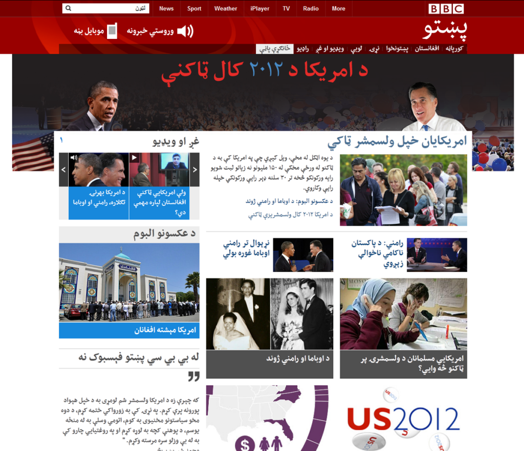
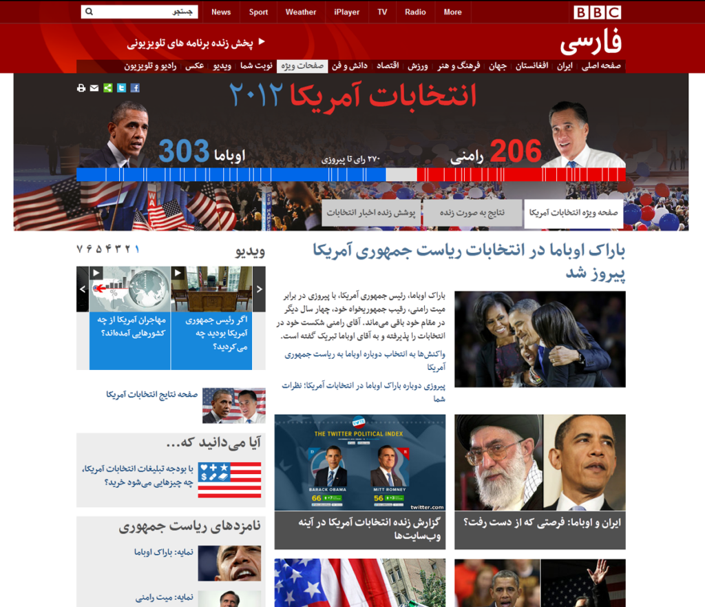
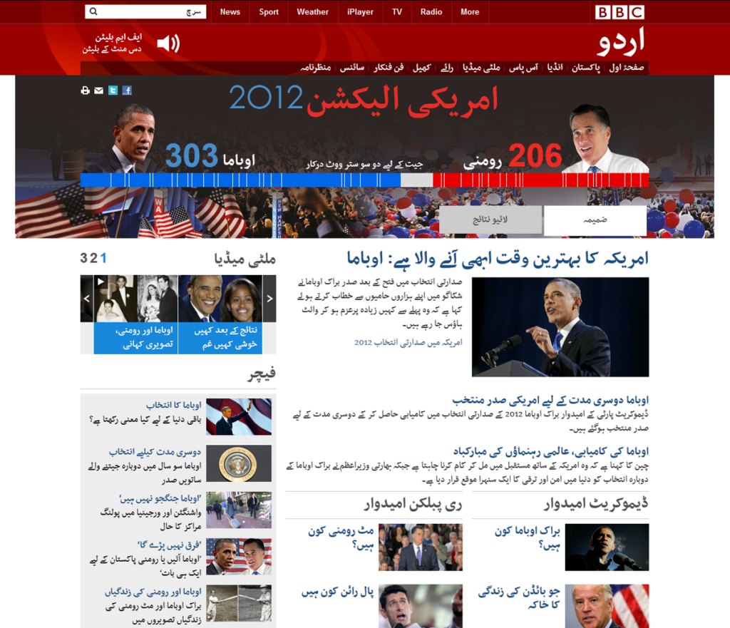
Kaveh: This is a good connection to the BBC project, your Nassim typeface. How you involved in the project and designed the typeface for the BBC website for the Arabic, Persian and Urdu services.
Richard: And Pashto, too, I believe!
Titus: Yes!
Kaveh: Oh yes, Thank you!
Titus: So that’s now already some 10 years ago, that in the summer of 2010 the design team of the BBC World Service approached me and asked me if I could give them my typeface, Nassim, for testing purposes, and that they were in the process of doing a redesign of their websites and that they were interested in trialing Nassim and comparing it to other typefaces.
Titus: And at the time I didn’t have any retail version of the fonts available. Nassim had been published with the Tasneem plugin in design, but that was a different format and it couldn’t be used in any other software. So I quickly put together a working font that was all but ideal, but I thought it would be okay for testing purposes, and at the same time, I didn’t have very high hopes or expectations that it would be taken by the BBC. It was my understanding that big companies or news corporations are usually reluctant to work with individual designers, especially small entities like me. Yep, and then a few weeks, I think, or maybe a couple of months later, they got in touch again and said, well, that they loved it and thought it was the best of all the typefaces that they had tested, and they would like to work with me in developing customized versions of Nassim that are tailored for the specific needs of their language services in the Arabic script. And they were and still are Arabic Persian would do and pass too.
Titus: And so we started a process in which we developed four sets of fonts of a regular and a bold weight each that were to be used for the websites of this language services. And maybe one detail that is quite relevant about this project is that, in 2010, for the first time, the so-called web fonts became a reality for web design. It was an idea that had been around for some time but the browsers did not support it. And so for the first 15 years of the worldwide web… or 15, 25. 25. Well, anyway, yes. No, it was 15 of course, 1995 to 2010. So for the first 15 years of the worldwide web, designers had to rely on so-called system fonts or… the technical term was the TrueType core fonts for the Web, as released and made available by the Microsoft Corporation.
Titus: And these fonts were a very small selections of fonts that web designers could be used because they were known to be installed in every operating system of every computer. So the website that was opened on either Mac or PC could then be displayed in the font that was installed locally on the machine. And that changed in 2010 because the browsers then supported web forms which meant that phones could be specified for every individual website, and were served like the content of the website through the server. So they needed no longer to be installed locally. And that was particularly important for Arabic in that case, and I think for most other underrepresented scripts could too, because it enabled a type of graphic design that was unthinkable previously.
Titus: The BBC in its previous redesign had hit this problem because they try to differentiate the design of the various language services. So they knew that the static preferences of Persian and Arabic readers are not quite the same when it comes to typography. And they also knew that the order readership has different expectations again. And the problem was that, whereas for Latin typography there were five fonts to choose from, in Arabic there were only two, it was either Ariel or Tahoma. Nominally, there was also Times New Roman. But Times New Roman and Arial are identical as regards to Arabic complement, which is quite shocking by itself.
Titus: And when the BBC tried to distinguish the design for these different language services in the previous redesign, they used Arial for Arabic, Tahoma for Persian, and for Urdu, they did something else. They had a custom font commissioned by, I think, Pakistani design bureau. And because the technology was not there yet, the users that were conscious enough of that, had to go and download the font file that was provided by the BBC, install it locally, and only then the webpage would be displayed as intended. And of course, in terms of user experience, that was an absolute nightmare. And so when 2010 came, they wanted to use web font for the first time. And so we used Nassim for that purpose and in close collaboration or rather consultation with the editorial teams of the different language services, we tweaked some details of the design.
Titus: When I designed Nassim originally, during my MA at Reading, I had thought of it as a contemporary news typeface that is inspired by the Persian typographic traditions, probably set too much fashion or taste. But without being Persian to obvious way so that it would also be acceptable for Arabic readers. And in order to now have different versions for these four language services, we took out some of the elements that were perceived to be more Persian and added some that were perceived to be more Arabic. Namely these were more ligatures and more letter variations that depended on the context for Arabic, and for the Persian context to take out all of these and give certain letters a more, let’s say, fantastic appearance, that is not as much inspired by manuscript forms.
Richard: As we’ve spoken before. And as you say, as you can set something in Finish, a typeface that’s acceptable in Britain, Germany, Finland, there’s really no difference, even though they have different histories and cultures. What is the basis of those different tastes in those different linguistic areas?
Titus: Yes, that is quite a… it’s a very good question and it’s quite difficult to answer. For the, let’s say, the Persianeid world, so the entire cultural sphere that was influenced over hundreds of years by the Persian culture first of the Safavid and then the Mughal Empire, they developed a very distinct manuscript tradition. It was dominated by a specific calligraphic writing style, the Nastaliq writing style. And that became the archetypal Persian way of writing Arabic. But because for, until quite recently, it was awfully difficult to reproduce Nastaliq in type, it wasn’t done. And when typography was introduced in Iran, the first typefaces were based on a different calligraphic style, and then with the Naskh style, which was also used occasionally in Iran, but was not as strongly associated with the Iranian culture. So then you already had a break of tradition and visual preference.
Titus: What happened then is that in Iran, they used certain typefaces, and I think by pure coincidence and chance, or let’s say commercial experience and coincidence, so these were metal types that, as far as I know, came from Russia, and they happen to be of a particular design that then came to be associated as specifically Iranian, Persian, just because that’s what was being used. And then that established itself in the 1960s when original Iranian types were designed by Iranian designers, who took cues from the existing typography that was practiced in Iran and gave it, well, their own interpretation. And these typefaces, mainly that type is called Nazanin by a designer called Haghighi, became the standard image of Iranian typography. And it is to this day the most used and the most influential typeface in Iran.
Richard: Yeah. I mean, that’s interesting because Garamond, I guess is probably the archetypal Western Latin font. And why is that? Well, Garamond designs are good, but the biggest printer in Europe who was Christophe Plantin, he used Garamond a lot. So that became a model for so many other typefaces. So I think that’s really interesting that there’s a Russian basis to contemporary or at least the Russian influence to contemporary Persian typographic tastes. And the same thing really applies to Helvetica. Helvetica, good face, sure, but Linotype really promoted it strongly in the sixties and made it widespread. And so people saw it a lot and then it became a standard, not because of any innate quality to it, but because Linotype promoted it so much.
Richard: I mean, of course, it had to be good or the promotion in the world wouldn’t have done anything, but it didn’t get as big as it did without having that economic promotion. So yeah, these strands running through typeface design are really interesting.
Titus: Yes, and it’s got a lot to do with some rather mundane qualities of the printing traits. There’s a lot of emulation. Things are being done because someone else has done it before. And then, “So how do we do this? So let’s have a look around. Oh yeah, let’s just copy that.” And that defined many aspects of typographic history in wherever you look.
Richard: Yeah.
Titus: What this means for me is that there is a huge responsibility on the part of the designers to put out practice that can be emulated, well, that can be a good model. Yeah? That is informed, and that is not prone to introducing ways of doing things less than ideal. And unfortunately that’s been the case quite often. And I think one way to avoid that is through research that one does not emulate whatever is being done at the moment or the current fad, but to look beyond that and preferably look into history and see where has it always been like that, and are there other ways of treating texts, because that’s what it’s all about, we want to give shape to text. And more often than not, we discovered it. Well, actually you may want to reconsider current practice in light of what was done before.
Richard: Sure. But you still have to consider current practice or you’ll [crosstalk].
Titus: Of course, you can only look at what was on before by knowing what is being done now, the two inform each other. It’s the… I don’t want to advocate just blind repetition, imitation of historical precedent. That’s the same again, but to have a critical understanding of how things evolved, that are being done now, and to know why things are the way they are. If you don’t know, you cannot change how they are.
Richard: Absolutely. Yeah. And research lets you do that and lets you reconcile those things, what has become the standard and what might be better. I always think about the QWERTY keyboard we all use, which is not the ideal keyboard layout, but because it was designed by typewriter manufacturers who wanted to avoid adjacent keys being hit, here we are with a QWERTY or AZERTY, whatever keyboard you use, at least in that Roman environment, and it’s not the ideal keyboard. You can change it a little bit. Well, you can decide where you’re going to put new keys, but the old keys have become like language, like English spelling, things that are not perfect, but are resistant to radical change.
Richard: Even Baskerville, Baskerville to us looks like a very standard typeface, but even the changes that Baskerville made to the Roman typeface were really rejected in England where he was working, and were only accepted and validated in Europe where things like the Romain du Roi and I guess the less conservative, may be more radical environment allowed for typographic change that probably wouldn’t have happened in England. And Baskervilles typeface, if it had just been in England, would have disappeared, never to have been heard of again.
Titus: Yeah, precisely. And it’s very much about the motivations that drive change. If you don’t know about the motivations, you have a hard time to assess the solutions that are being found. And for me the stark example in Arabic typography or type-making is the case of simplified Arabic which is a kind of Arabic that was developed based on the model of the typewriter for no other reason but economic expediency of newspapers in the 1950s. Well, they had to use Linotypes because they were the fastest way of producing newspaper copy.
Titus: And in order to type faster, they wanted to reduce the number of characters that were available. And so they looked at the example of the typewriter, which by the virtue of its small keyboard had only 90 characters, since they said, “Well, let’s adopt this, let’s do these too. We can also have a printing type on our Linotype machines so it has only 90 characters. That means we can put it into one magazine and our compositors will key much faster. We can save, they can do their work in less time, we don’t have to pay them as much, we have more output, we can put our newspapers out more quickly.”
Titus: All of these may have had its justification in the particular setting of 1950s newspaper-making. But then because of this precedent, everybody started to copy it. And it was, “Oh, what do we use for news? Or we use simplified Arabic?” And even when photocomposition allowed to have more and richer character sets, some manufacturers still emulated the simplified version. And Linotype, they did try to reevaluate and improve the existing type, but not every competitor.
Titus: And so over a number of different technologies, the same concept was introduced into personal computers and became the basis for the default Arabic typefaces that are now on the windows platform since the late nineties. And there’s something wrong here, because if you know where it comes from, you may reevaluate and reassess it. Well, actually we have now a computer that works entirely differently to a Linotype, hot metal line caster. Maybe the typeface should also be different.
Kaveh: I want to change the direction here to cultural and language differences. We have similar linguistic areas with different scripts and writing systems. At the same time, various languages use a script or an alphabet of a similar source or the same. We can also mention that calligraphic and writing styles are varying in cultures and during the time.
Your BBC project, or Nassim project, is an interesting example of how a broadcasting corporation recognizes the differences between language groups using the same script and is asked to reflect it in the typeface style.
But we don’t see the same approach often for the languages that use the Latin-based alphabet. This is true especially on digital-based applications, like websites, messengers, digital publications and so on. We can see a flattening effect happened for the Latin alphabet. What do you think about these differences, and maybe what can we learn from recognizing the cultural differences in using the Arabic script?
Titus: I think it shows us two things. It shows that script and language are distinct. Yeah, you can use the same script to write all different kinds of languages, which also means that you use the same script in very different cultures. And that is something that is quite often overlooked by the casual observer.
Titus: And it also shows us that the belated adoption of typography in most parts of the world maintained a stronger local visual identity than was the case in the more globalized typographic world of the West, where of course things also used to be more regionally different. So in 1950s newspapers looked very different between France and Germany or the UK. But in large part, I think because of globalization, you get a flattening of visual distinctiveness because the same entities, the same corporations want to look the same wherever they operate, and especially now that news are mainly consumed over the internet, you wouldn’t make this distinction as much anymore.
Titus: But in the Arabic script world that stretches from Morocco to Indonesia, because typography didn’t set to a homogenous appearance quite as strongly yet, there are still much more pronounced regional preferences and that is particularly strong. If we look for example at South Asia or Pakistan where as far as I know up to this day, there are still newspapers, main daily newspapers who rather than using existing fonts, they put images that have been typeset locally. They put images out onto their website because they can typeset in the Nastaliq style locally, but can’t or couldn’t do it until quite recently on their respective websites. So that indicates a very strong cultural preference for this particular calligraphic style.
Kaveh: It’s interesting. Also, looking at the BBC project, they decided to distinguish the typeface styles based on the languages rather than the regional typographical styles. The divergence between, let’s say, the calligraphic styles of Morocco and the calligraphic styles of Iraq might be more distinct than between Iraq and Iran. But here, the language is the key for dedicating type design to their services.
Titus: Indeed. And there are a lot of cultural achievements, if not lost, they have been hidden. And I think a lot of the interests now goes back to pre typographic times emerges from this realization that there is such a rich visual of culture that is just waiting to be rediscovered and adopted for contemporary purposes. So yes, in the Arabic script world, there were so many different writing styles, and hardly any are still widely practiced or known by the casual reader. And that could of course be changed nowadays, of course we could use the Maghrebi writing style from North Africa. And there are attempts to create new typefaces that are not based on the predominant Naskh style, but on other stuff. And I think this rediscovery of cultural variety and richness is actually gaining momentum.
Richard: Because to some degree it seems that typefaces or not typefaces, but script styles in Arabic that used to have particular purposes or used for particular purposes of content are used now in different visual contexts. Now, correct me if I’m wrong, because I may be wrong, but I have the impression that Kufic influence styles are used for display typography quite often, but they’re not used for text typography. And like I said, that may be a misapprehension on my part, but that’s the impression I have.
Titus: Yes, I fully agree that that is the general tendency, but maybe one caveat is that these are not Kufi and there is nothing Kufi because it’s a very bad term. I agree with you that it is used in that sense, but even paleographers actually say there is no style called Kufi because we don’t know what the Kufi that was written in the eighth century in Kufa in Iraq looked like. We actually don’t know that. And so it’s been adopted by later Islamic scholars to describe something that no one’s ever seen. And then Western scholars adopted it from them, and typographers or top designers very recently adopted this term to denote anything that is quite geometric and modular. And the curious aspect is that hardly any casual Arabic reader can read the old manuscripts that may be called Kufi.
Titus: They have a very different architecture that is awfully difficult to read for the contemporary reader. So what all these Kufi typefaces, they are essentially using Naskh shapes, but morph them into a kind of hybrid that borrows the rigidity, the modularity of Kufi, but maintains Naskh letter forms, creating a kind of a hybrid typographic hybrid.
Richard: Oh, that’s very interesting. I had no idea.
Titus: So yeah, I just want to say that the term is a little bit unfortunate because it suggests or describe something which it doesn’t really. Also, again what you said about the usage of these different types, yes, historically that was certainly the case that different calligraphic, different handwriting styles were predominantly used for specific purposes, especially in the last phase of Islamic manuscript culture, this became very developed in the Ottoman Empire where the Ottoman chancery had all these different hands for different purposes. They had specific staff for edict of the court and they have a specific staff for the land register. And then just by convention and repeated use, other styles were used more frequently for correspondence and others more frequently for the Koran. So yes, historically that was the case, but today, let’s say this culture is not readily accessible anymore, especially not for typographers. There is a very small group of trained calligraphers that are trained in this classical education that are aware of these conventions.
Titus: But this is not reflected in contemporary typographic practice. And the thing about the contemporary Kufi, inverted commas types, often it can be quite misleading because, say for example, Frutiger Arabic. Frutiger is a sans serif. In the Latin form, it’s a Sans serif type that is known to be really readable and usable for a multitude of applications. The Arabic component is very geometric and modular, and so falls into this category of contemporary Kufi typefaces. But I am skeptical if this kind of style and design does fulfill the same purpose as the original Latin Frutiger that has this very broad, potential use basis. These are some of the open questions that I alluded to earlier that are still in the process of being sussed out and negotiated.
Richard: That’s interesting because there is quite a parallel, I guess, to the Roman version of italic, which started off as being a particular kind of writing style used for communications from the Pope or the Vatican within the church, the chancery style, and then that became adopted eventually to be used for emphasis and things. It’s parallel in that it started off with a completely different purpose and you wouldn’t mix them before, and then sometime in the 1500s, it became a way you could use that chancery style as a means of emphasis or means of demarking a different kind of content, nothing to do with that original form that came up.
Titus: Yeah.
Richard: But now it’s just there. You expect every typeface to have an italic and it’s unrelated to its original purpose.
Titus: Exactly. And that’s again a reflection of the long typographic history of the European world, where the core typeface family that we talk about now, which is a regular and an italic and a bold, in fact, mixes and bundles together for disparate writing styles and cultures. There are the Roman capitals, there is the Carolingian minuscule, there is the Cancelleresca, the chancellery script, and there is the 19th century boldface. And now they’re all are assumed to be part of one homogenous entity. And of course, one should know where this is coming from to better understand it. And curiously, we should also, as regards the mutual cultural influences, it’s also worthwhile pointing out that, well, we all use the Arabic numerals that were not part of the European tradition, but we adopted them from the Arabic world.
Titus: Another thing that comes to mind is of course the question of the complimentary style. As you describe each of the italic, only was added to the Roman for emphasis. And in Islamic manuscript tradition, there was a lot of mixing of scripts of styles for emphasis for different texts categories. But that was partially lost with typography because it was, of course, more effort to make more typefaces because essentially an italic is an additional typeface. And if you wanted to make another complimentary for an Arabic typeface, you would have to conceive of that in first place. So there is no Arabic Italic, but when we look at the sources, when we look at manuscript tradition and also 19th century typography, we see that the indigenous use of the script just combine different writing styles.
Titus: So for example, it was in the 19th century, there were printers using Naskh as the main body type and then the Ruca style as a complimentary emphasis style. And of course that is something that could also be done today.
Richard: Right.
Kaveh: Even today, sometimes I see an Italic version of an Arabic or a Persian typeface. There are slanted right or left. It’s an ongoing discussion about which one is the right one. Maybe the right question is not which way letters should lean toward, but which complimentary style should we design for Arabic typefaces.
Titus: Now, absolutely, that’s very much what I was getting at. The artificial slanting is a pure product of technology. And that again harks back to what I was mentioning earlier, that you need to research before you make design decisions. And if you know that, well, the slanted area because in that form has no precedent whatsoever, but it’s only a product of photocomposition, and later on digital tech, then you may see that it’s probably not the best solution and it would actually be much better to have a properly designed complimentary style, which of course is much more work and therefore more expensive, and therefore it’s not being done.
Kaveh: Although the conversation is very interesting to me, I have to be respectful of time too. So, I turn to Richard. Is there anything you want to add to this episode, as there will be a second part to this talk?
Richard: We did have this question and we’ve touched on it a little bit, but I still think it’s an interesting one, is with typeface design as we practice it, if we’re practicing it in the sense of not just doing it as artwork, we have clients, right? Who pay for the typeface. We have users who are the people who, let’s say the designers who use the typeface, and then we have the readers who are reading the typeface. And I think this came up a little bit in our earlier discussions about the BBC, is what is the role of those stakeholders in design? How do you take this into account? Tell me Kaveh, if I’m getting too much into the next stage, but it is relevant to the BBC project and to much of what we’re talking about. So can we ask that now or should we save that?
Kaveh: Yes, sure! Please!
Titus: Yeah, and I think that is a very good question, and potentially a controversial question. Yes, the different stakeholders. I’m reluctant to put them all on the same level because reading is second nature to any literate person. Everybody who can read will just read pretty much anything thrown at them. And that does not make for a good judge of the design of the reading material that is thrown at them. So I’m hesitant to give too much weight to, let’s say, the opinion of crowds-based opinion finding. I’m somewhat skeptical of that. I don’t think it can inform the design process in a very meaningful way, let’s put it that way. Is that what you were referring to?
Richard: I guess so, but in some sense, it is already informed by the previous expectations of the reader. And the example I gave in my typographic classes is, you might design a better alphabet, and it’s just a better alphabet for so many reasons, but if people don’t recognize the letters, then it’s not a good alphabet. If I set something in all caps, it might look awesome, but people are probably not going to read it, they’re just going to look at it and say, “That looks awesome,” but their eyes are going to glide off that all caps setting, if it’s, well, a long setting. So in some sense, you have to deal with the expectations of the reader. As I was saying before, if I want to manufacture and sell a computer, even though the coding keyboard may not be the best keyboard, I’m going to have to make it the coding keyboard. So there is that unavoidable reliance on the experience of the reader.
Titus: Yes, certainly. But I think that happens on a very low level.
Richard: Yeah.
Titus: And that’s because… That’s what I was trying to suggest at first, when I said to you, anything that people are thrown at, they will be reading. The threshold for a reader to consciously say, “Well, I’m not reading that,” is extremely low. People are going to read stuff, even though it is hard to read, even though it is awful looking, just because they want to get the content.
Richard: Right.
Titus: Yeah. So this relationship is not necessarily helping me to achieve better design because the information that I get, well, will somebody read it or not? Well, let’s say, I really need to produce something abysmal and completely failing for people not to read it.
Richard: Yes, for sure. And that’s the thing. And as I was saying with the all caps thing, we all have some degree of choice in what to read. And if your newspaper, if the Titus Nemeth newspaper, is set all in upper and lower case, and my newspaper, the competing newspaper, all the texts is set in all caps, I suspect that your newspaper, even though my content is better, I will claim because it’s my newspaper, they will read your newspaper. So I just think it’s not an important part of the design, but it’s still kind of in there, is that the characters have to accord with the reader’s expectation of what a thing should look like to some degree. And I get what you’re saying, it has to be truly abysmal not to read it, but there is some degree of choice in what people read. And so you have to start from where they are to do the change or something. But that wasn’t my only question either, it’s also the client and the users, as I say, the designers.
Titus: Yeah.
Richard: What part do they play or do they not play a part?
Titus: Absolutely, yes.
Richard: I mean, they obviously play a part because they’re paying you, which is an important part to play.
Titus: No, absolutely. And they can play a very productive and important part, I think. If you want to go back to the project for the BBC, it’s probably quite typical in the sense that the client has some ideas about the formal expression that they prefer, but they don’t have any language to express that in a concise manner that can be translated into an actual shape. And so a lot depends on communication. So that’s what we designers ought to do constantly with our clients, that we need to try as best to understand what they are trying to tell us which may not always be in a language that we would use when we talk between ourselves. Of course the situation was that, as you mentioned, the expectation very much shapes what people think is best on how things ought to look like.
Titus: And in that particular case a lot of the feedback that I was given when I showed my suggestions, when I showed them the Nassim typeface, was that the editors and journalists that were involved compared individual letter shapes to individual letter shapes of Arial, and nevermind the origin of Arial, and nevermind its intrinsic design quality or lack there off. That was their point of reference. And I had to argue why I thought my suggestions were potentially better. And that was, of course, quite a difficult exercise, especially as a non-native, as some people like to call me, as an Austrian who works with Arabic type, I had to engage the opinions of, say an Egyptian or Syrian editor who worked at the BBC. And I had to argue based on what I had learned about the script and about typography, whereas they would argue based on their upbringing and what they know just by virtue of having spoken and learned Arabic from childhood. And these are not necessarily comparable because these are very different kinds of expertise.
Richard: Absolutely. And so in some sense, the role they play can be somewhat of an obstructionist one in some cases, I guess, because they have this experience, the kind of thing I was alluding to before, they have certain expectations, they’re used to the Arial. So they think of aerial as the model and think about how your typeface compares in their minds, favorably or unfavorably to Arial.
Titus: Of course.
Richard: And that really brings up an important part of the designer having to not just go, “Okay, whatever you like, I’ll make it look more like Arial.” It is the role of the designer to defend and promote those decisions that they make. So I think that that role they’re playing is… When I say the role, I’m not saying necessarily contributing role entirely, but it’s a role that you have to deal with. Yeah.
Titus: Absolutely, yes. I mean, in the case of the project with the BBC, of course, on one hand it was the feedback of the journalistic team. On the other hand, of course, I dealt with the design team who had chosen my typeface in the first place and thought it was good. And they backed my suggestions and decisions and incidentally, the two designers that I worked with were a Lebanese woman and a Turkish man, and so their expertise was on one hand. Like the creative director was of Turkish origin, but he did know about the Arabic script, but his designer was Lebanese, so she was a native speaker and a designer and she had chosen Nassim as superior to other typefaces. And of course that gave it credibility also facing the feedback from the journalistic side.
Titus: What you mentioned about having to argue and to demonstrate, yes, very much so, I couldn’t agree more. I think that as someone who’s come to the Arabic script world from the outside, I have a constant need to justify my position anyway, which is a challenge and an interesting, and a good challenge in many ways. And it leads me also to some curious and quite funny moments where I remember when I taught in Morocco. At some point one of the students we were doing basic introduction to type design and we started with some pixel fonts and he was drawing a letter shape, he was constructing a letter shape with pixels that does not exist in Arabic. Imagine it’s like he did what would be the equivalent of taking a capital R and adding another diagonal leg on the left side. A letter form that does not exist. But he [crosstalk].
Richard: [crosstalk] Russian, but…
Titus: Yes. Well, in Arabic, yeah?
Richard: Yeah.
Titus: And so it was a Ta (ط) and he added the bowl, like a Sin (س) bowl to the top. And he argued with me. He said, “No, what do you know? I know better. Look, I’m Moroccan,” yeah? And I had to show him this letter does not exist. And of course he was too proud to admit that he was mortified, but I think he was. And yep, I mean, that’s again what I was trying to say earlier, the native competence is a very different one to the specific learned type design typographic competence, because else you wouldn’t need type designers or typographers if anybody who spoke a language was also a type designer or a typographer in whatever language you happens to speak or have learned from childhood, then yeah, there wouldn’t be such a profession.
Richard: Yeah, good answer!
Kaveh: Before closing this episode, is there anything you want to add here, or did we miss some points?
Titus: Well, we haven’t raised that whole thing of Latinization,
Kaveh: Yes, exactly.
Titus: I mean, a little bit, but not explicitly.
Kaveh: That’s an essential question for me, and I highlighted my notes to ask it for the second conversation. And Richard?
Richard: No. I think that’s pretty much what I had on what I was thinking from the notes that we had.
Kaveh: Thank you both very much for being here and for the conversation. I feel pleased to start the Typocast and having you two for the first episode. I enjoyed every minute of this conversation. Titus, have a good afternoon in Austria, and Richard, have a good day in Toronto and talk to you soon.
Titus: Thank you very much. Thanks Kaveh and Richard, and thanks for organizing it, making it all happen. And yes, I also very much enjoyed our conversation.
Richard: Yeah. Thanks Titus and Kaveh, and Titus, it’s an education speaking to you. I find out things that I had no idea about. So thanks for that.
Titus: Thanks, means a lot.
[Music]
Kaveh: It was episode 19 of quantization, Arabic type with Titus Nemeth!
We want to thank Titus and Richard for being part of this conversation.
And a special thanks to Marshall Bureau For composing all tracks for Typocast and Quantization.
Please share your comments with us; check out our website Quantization.ca for more discussions and full transcripts, and come back for the second part of this episode.
[Music]